Our current order processing time is: 2 business days
We sell B2B only. In most states, a signed sales tax exemption form is required to purchase. Our minimum order is $125.
Inspiration & Education
DESIGN GALLERY
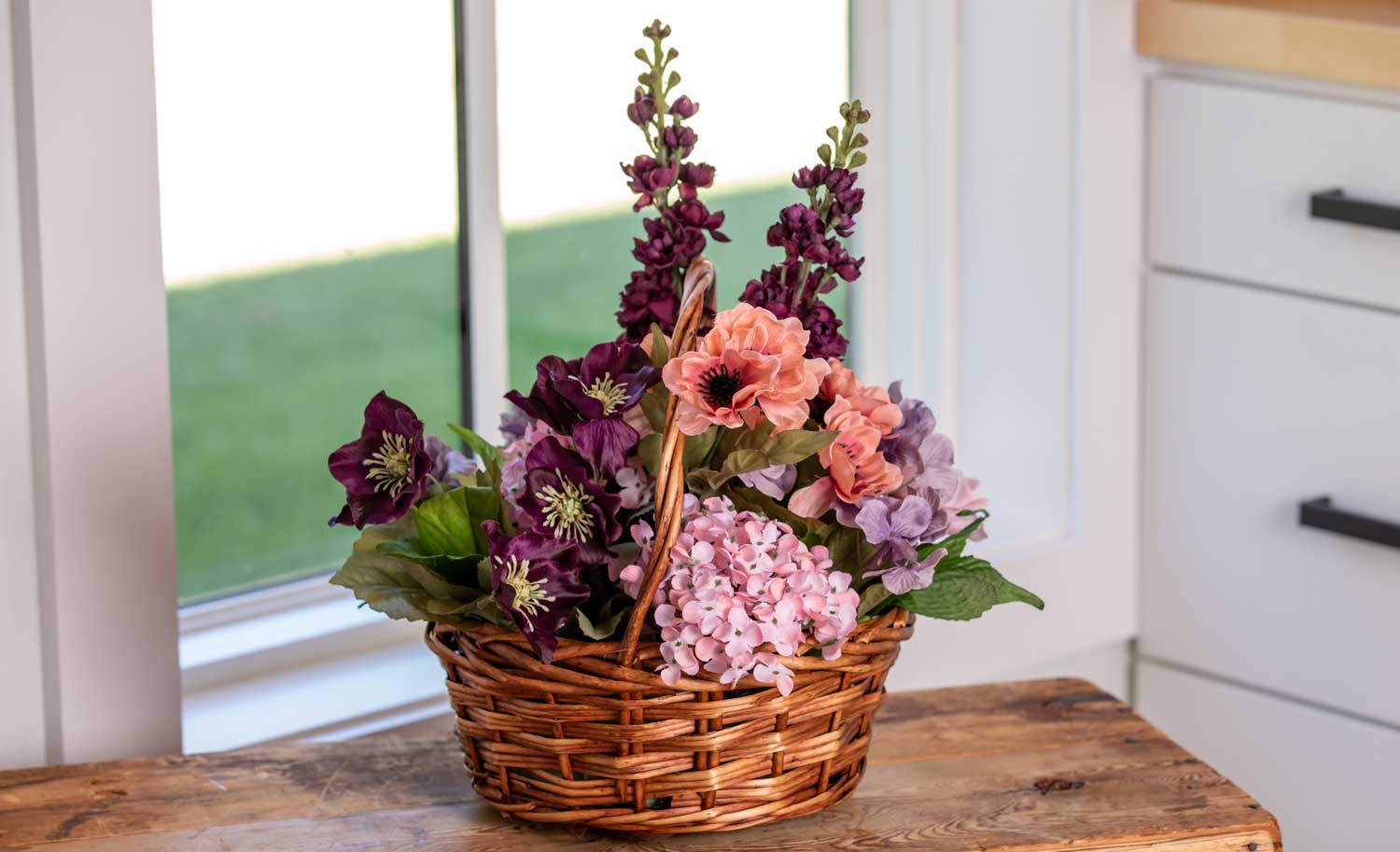
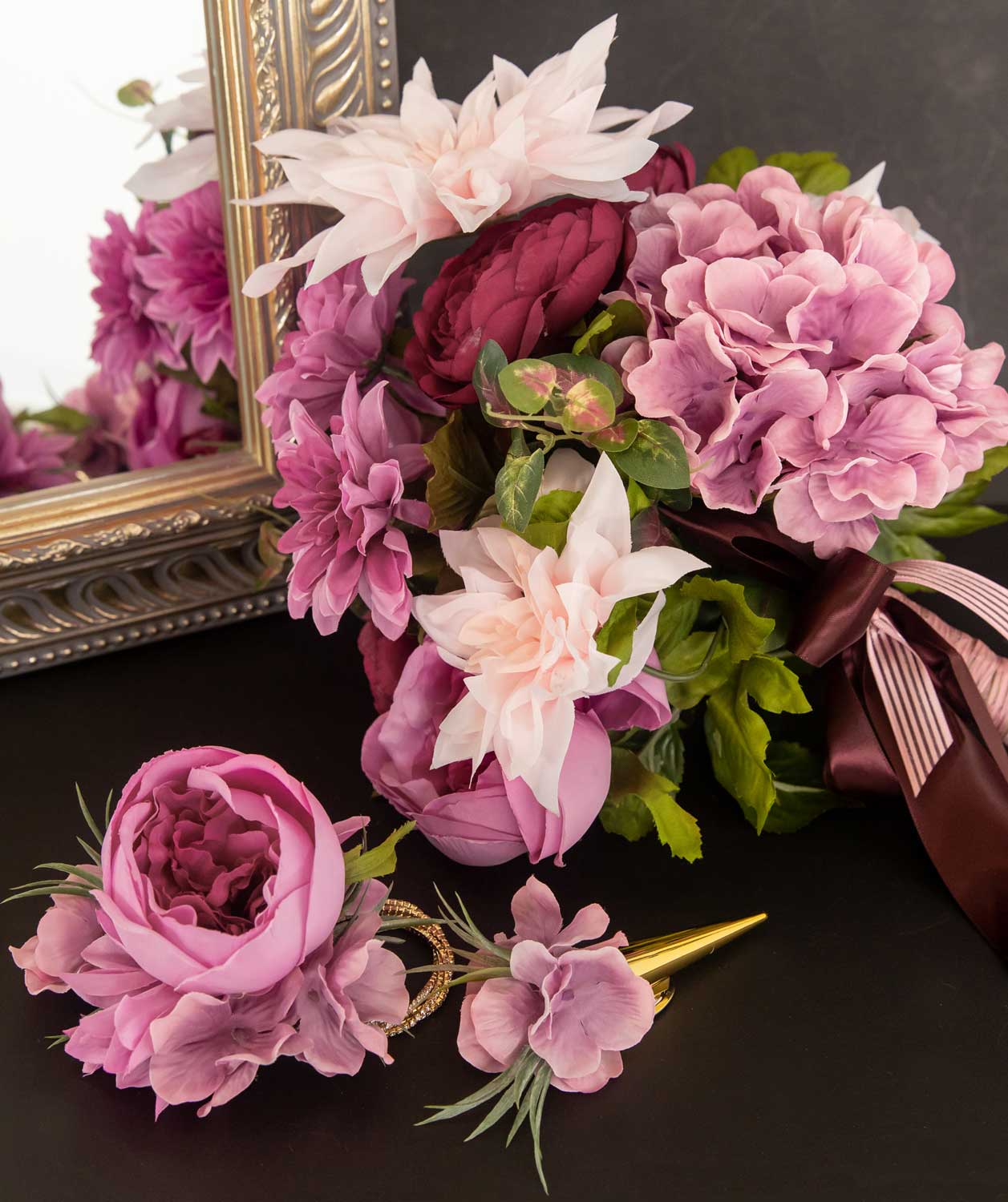
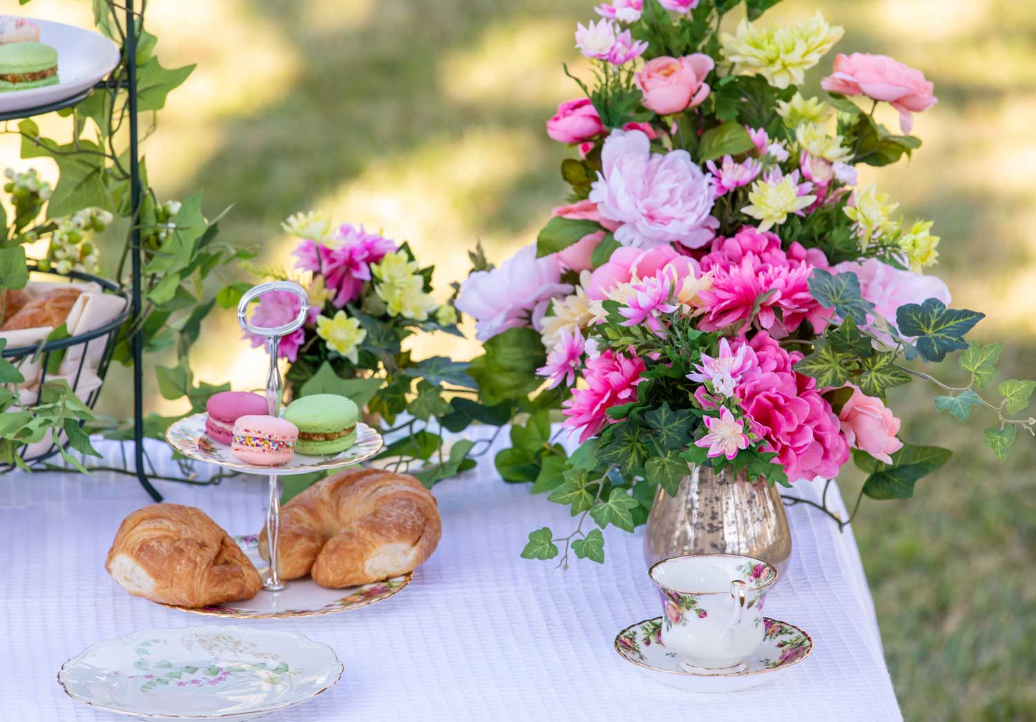
If a picture is worth a 1000 words, then this is the most valuable section of our site! Get inspired by beautiful designs!
DESIGN VIDEOS
View our design videos for the latest tips and tricks for the industry.
BLOG
Check out our blog for the latest articles on tips and tricks for the industry.
Pioneer: Color Coordinating in a Digital World
Color matching can be a challenge, especially when shopping in-stores is not an option. We all see color differently and products can appear to be different shades in different lighting. When you add in the complications of cameras, monitors and phone screens – color matching is never simple! At Pioneer, we pride ourselves on customer service with real people standing next to the real product. Although we can’t promise exact colors, we can promise coordination and style. Shopping from a company with a solid return policy is good; not having to act on that return policy is better.
When you’re asking us about color, remember, our silk flowers are made to look like the real thing, complete with color variation and gradient in the petals. Many of our items are handmade, so dyes and details WILL vary.
If you’re on the phone with us, we promise, we do our best, but sometimes things can get lost in translation. The language used to describe colors varies from person to person, so here are some tips to ensure you understand color before you order.
Build your color palette
Instead of putting all your confidence into a single color, focus on selecting a color palette from the same supplier. Even if the colors appear to be a different shade in person than on the website, they will likely still match very well. This can bring peace of mind and allow a little bit of wiggle room when dye hues are not guaranteed. Shopping our seasonal collections can greatly assist with this.
This will help you beyond your buying too! You can manage the expectations of your client (especially a bride!) by describing coordinating colors in a palette, not promising an exact match. As a result you’ll have less stress and produce a richer look that exceeds expectations.
Go deep. Our website is chock full of photos and information!
Every product on our site includes a description of the product and its coloration. This is to avoid any confusion in color descriptors and to give further specifics on whether an item has warm or cool undertones.
Under each product, look at the full carousel of photos. Click on them to view them larger. Get a better sense for how they look in arrangements and alone, and next to other materials you recognize the color of like baskets…. Monitors, screens and cameras vary, so we show you as many angles as we can.
Try it out!
Most products don’t have a minimum order, so samples can be purchased in order to see what the color will be like in real life. This can greatly help bring peace of mind and can save you from returning a product you were not satisfied with.
Share your knowledge
Get recommendations from your friends, and ask them what they’ve bought from us. When you finish a design, post it on your social media and be sure to tag us – and the color you used. For example, when you post #PioneerBlueSky others can see more of what that looks like in a finished arrangement.
Final pro tip: Stuck between two shades? Always go for the lighter one – if necessary you can deepen the color with a spray.
Someone’s idea of “teal” may be different than yours (or ours!), you may be able to bridge the gap with these solutions. At Pioneer, we will continue to fill in any blanks for customers looking for assistance in color planning, but know this will help you rest easier when purchasing.
A Collaboration from Sarah Botchick of Pioneer and Blog Writer Laura Vitale.
