Our current order processing time is: 2 business days
We sell B2B only. In most states, a signed sales tax exemption form is required to purchase. Our minimum order is $125.
Inspiration & Education
DESIGN GALLERY
If a picture is worth a 1000 words, then this is the most valuable section of our site! Get inspired by beautiful designs!
DESIGN VIDEOS
View our design videos for the latest tips and tricks for the industry.
BLOG
Check out our blog for the latest articles on tips and tricks for the industry.

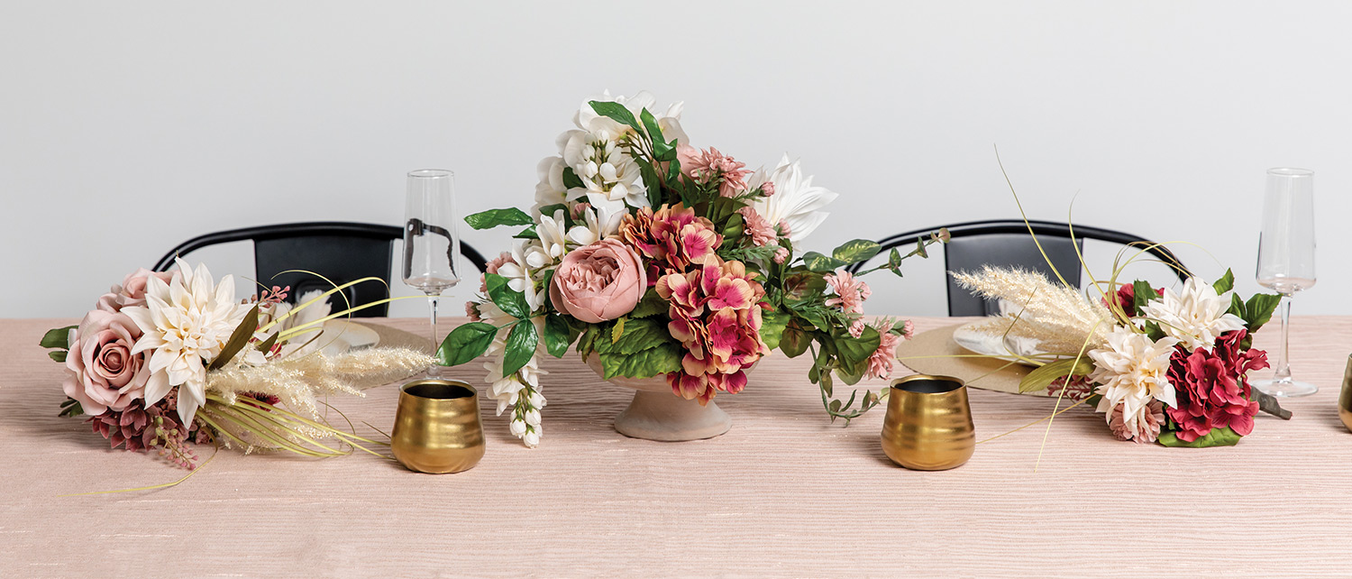
Square Color Harmony + Fall Festival Collection = Power Designs for Fall!
Just because it’s fall doesn’t mean muted palettes — you can use vivid colors too! Grouping red, orange and navy blue thoughtfully in floral is a risk that pays off in impact.
But “You wouldn’t have to put it away as a seasonal composition,” reminds Tom Bowling, AIFD, PFCI. “Commercial is a good place for stronger design.”
As many offices have neutral-colored walls and floors. Bold flower colors draw the eye, giving offices a dynamic and captivating energy. Remind your customers their décor reflects the company’s personality and values. People’s first impressions can be that of enthusiasm, welcome, and strength with vibrant, well-designed flowers.

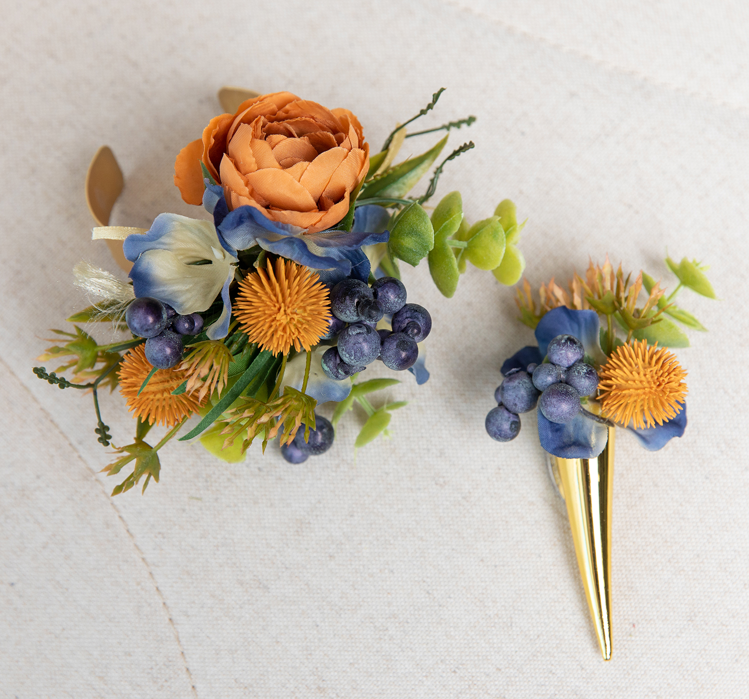
Combining both warm and cool tones can bring depth and contrast to a design, but they can take a bit of finessing to pull off. Tom Bowling, AIFD explains how he makes these bold shades work together by grouping.
Grouping is using color in masses together, as Bowling did in the design here, with “bridges of color.”
“Using reds at the top, berries bring the eye down, and the blue anchors your eye.”
Bridges of red get us to blue. Form flowers and berries guide you through. [We used] berries to move from stronger form flowers with textural interest. There is an area of interest and an area of relief.”
“The Fall Festival collection is a festive presentation for your eye. Lots of interest. Include pods, weedy textures… think about what you’d see in a seasonal garden. It bears further exploration when you approach it.”
When describing another design, Bowling explained, Because the navy is recessive in this arrangement, it might not be the focal, though it commonly is.
“When I teach design I ask, Where’s your focal area? Well, sometimes there is none. In this case the blue should be, but because navy is a recessive area, you may see red first, maybe the orange. No definitive focal can be ok.”
In a square color harmony, there’s a combination of four colors that are equally spaced out around the wheel. Because a square color combination gives you four hues to work with, you’ll always end up with both spectrums of colors temperature: two cool colors and two warm colors. But square colors, when done right, are extremely rewarding. Sharp in contrast, ideal for commercial design, mix these varieties for fall fun.

Florists and event designers may even pull from this collection for the fall bride. Imagine the wedding party wearing navy suits and using copper details. Orange and yellow flowers, maybe even a pumpkin, would add to the celebration. Oranges and blues are made for each other because they sit opposite each other on the color wheel. Plus, we are seeing many couples being confident about a strong color palette.
Consider it for fall formal dances and homecomings as well.
There is a way to play with contrast in a thoughtful and elegant way -- and that is fall festival.
A collaboration between writer Laura Vitale and Sarah Botchick of Pioneer.